Showing posts with label digipak. Show all posts
Showing posts with label digipak. Show all posts
Sunday, 28 April 2013
Final digipak panels
These are my final 6 panels of my Digipak, 'From rags to riches':
 |
| 1. Front Cover |
 |
| 2. Inside left |
 |
| 3. Inside centre; CD holder |
 |
| 4. Inside right |
 |
| 5. Outside centre |
 |
| 6. Back cover |
Friday, 26 April 2013
Tuesday, 19 March 2013
New Digipak front cover
I have decided to change the look of my front cover for my digipak, mainly because I am no longer fond of the previous one. My new cover will be this;

I feel that this picture has a much better look to it, and is more fitting to the music genre of our band. The font style and colours are also more fitting to the picture, and stand out well in contrast to the colours in the background. There is still a link between our music video within this picture, as we use this exact piano in the making of our video, and this picture also fits in well with our song choice due to the piano tune heard in the song.
I do still need to add on and edit extra panels of course, which I will show on my blog when done.
Tuesday, 26 February 2013
possible digipak panels
These are the possible images I will use for my digipak. Note: These arent final so I will definitely be making changes and adding the final images to my blog!


I like this image of mine and Bens shadows as it is unique and also highlights the 'natural' imagery theme I am aiming for. The way the shadows stand out I feel work well with the grass, and, as you can see, the raised arm of one of the people again highlights the notion of reaching the top, as he is pointing upwards to symbolise progression.


The theme which I am going for within my digipak is of natural imagery, highlighted by the pictures of the sky and the trees. I took all of the pictures myself and so none have been copied. The faded brown colours are that which I am going to use for each panel of the digipak so that each panel smoothes nicely onto the next and the digipak flows well.
The theme which I am going for within my digipak is of natural imagery, highlighted by the pictures of the sky and the trees. I took all of the pictures myself and so none have been copied. The faded brown colours are that which I am going to use for each panel of the digipak so that each panel smoothes nicely onto the next and the digipak flows well.

This picture really represents what the songs lyrics (Hall of Fame) are about, with the trees symbolic of reaching the top. The narrative within our video is of an athlete striving to reach the top and the tree displays how the athlete 'branches out' to reach the top, and that well known saying that 'the sky is the limit', displayed with the clouds blending with the trees.

This panel is the one I intend to use as the CD holder, hence the big red circle. I used the image of the curtains as symbolic of opening the case, as I have done with the front cover. This highlights the anticipation the buyer would hopefully have of listening to the CD, as you would do when waiting for the curtains to open in the theatre.

This image was taken in the school hall, the same place as some of the footage of our film. The lights I feel stand out well in contrast to the brown background, however the big gap to the left of the picture deteres the quality of the image, and is something I will adress.

I like this image of mine and Bens shadows as it is unique and also highlights the 'natural' imagery theme I am aiming for. The way the shadows stand out I feel work well with the grass, and, as you can see, the raised arm of one of the people again highlights the notion of reaching the top, as he is pointing upwards to symbolise progression.
To gain the faded brown colour on most of the panels I had to use a brown background for each picture on 'Photoshop', and edit the picture from 'normal' to either 'Pin light', or 'Linear light', depending on which effect worked bewst in displaying the fade in each picture.
Digipak back cover?
Here is my initial idea for my digipak back cover:


Although the back cover may look a bit blank, I am still going to add onto it the details such as Distributer and Manufacturer for the album.
I took all pictures I am using for my digipak myself, using my schools 'Nikon SLR 500' camera for its good quality photos.
To achieve the colour change from the original picture I used 'Photoshop' and added a brown background layer whilst changing the image from normal to a 'Pin Light' effect in order to merge in the brown colouring with parts of the image. I feel this effect works well, as it gives a contrast of colour to the original image and also allows the sun to be more demanding and dominant in the photo.
Aswell as altering the image, I have also added in the barcode from an internet picture, and used 'Text' to include the song names and price tag.
 |
| Edited image |
 |
| Original photo |
Changes I plan to make:
1. Include the extra details such as manufacturer and distributer
2. Perhaps include album title on back cover also
3. Include more song choices as only 4 choices is small for an album
Friday, 22 February 2013
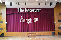
Digipak front cover
Here is a picture of what my digipak front cover image will look like.
The thought process behind this image is that it is simple and not too 'overpowering' as to distract attention away from the band name or album name, which is essentially what we are trying to display.
In addition, the curtains suggest that a show is about to start, which highlights the anticipation and excitement one feels as a show is about to begin. This can be converted to display how my album would excite its audience and that in opening the curtains (a metaphor for opening of the digipak) the audience will be pleased with what they find inside.
Furthermore, the title of both the album and band are written in a bold white, which makes them stand out in contrast to the red of the curtains. This allows the audience to be drawn to the names due to the way they stand out, and so our band name will be the first thing they're drawn to.
Lastly, there is a strong link between the front cover and our music video itself as this cover is a scene in which we used in the video, and so this intertextuality can be shown to promote our video through my digipak.
Thursday, 21 February 2013
Album name
I have decided to go with the album name of: 'From rags to riches'.

I feel that this name highlights the message of the song perfectly and also ties in well with the new, more serious outlet that our band is trying to represent. This album name also reflects the inspirational nature of our video and the songs lyrics, as we have attempted to portray an athlete that works hard in order to go from loser to winner, something that the 'American Dream' represents.
I feel that this name highlights the message of the song perfectly and also ties in well with the new, more serious outlet that our band is trying to represent. This album name also reflects the inspirational nature of our video and the songs lyrics, as we have attempted to portray an athlete that works hard in order to go from loser to winner, something that the 'American Dream' represents.
Possible Album names....
Unsure as what to call my album name (although I should know by now), so here are a few ideas I have;
'Gold'; this name would fit well with the meaning of the 'Hall of Fame' lyrics aswell as our video, as gold is the colour typically associated with sporting success, i.e. Gold medals.
'Dreamers'; this would link in well with the 'dream come true' notion hinted at within the 'Hall of Fame' lyrics in the sense that anything can be achieved.
'From rags to riches'; this name ties well with the intertextuality within the 'Hall of Fame' of the 'American Dream'. The 'American Dream' is the belief that anyone can go from 'rags to riches' to achieve greatness if they work for it; this supports what we are trying to display within our video.
Wednesday, 6 February 2013
Digipak Layout
A typical digipak will consist of either 4 or 6 panels, and will include the CD(s), track listing, album name, band name, barcode, and other additional information/features.
A 6 panel layout has far more room for design and information than a 4 panel layout, and so will usually contain more content. With a 6 panelled digipak, there tends to be more colours and images in the background due to the extent of room available, allowing the artist to display the alums message well through the artwork of the digipak, as well as the ability to make the design more creative and complex. A 4 panelled digipak, on the other hand, is usually more simplistic due to the limited room for design and so the image must stand out in order to catch the attention of its audience, as they rely on quality, not quantity.
A 6 panel layout has far more room for design and information than a 4 panel layout, and so will usually contain more content. With a 6 panelled digipak, there tends to be more colours and images in the background due to the extent of room available, allowing the artist to display the alums message well through the artwork of the digipak, as well as the ability to make the design more creative and complex. A 4 panelled digipak, on the other hand, is usually more simplistic due to the limited room for design and so the image must stand out in order to catch the attention of its audience, as they rely on quality, not quantity.
 |
| 6 panels |
 |
| 4 panels |
Monday, 4 February 2013
Digipak research: Digipak vs. CD case
Digipak:
Digipaks tend to be far more informative than a CD case as they usually consist of 6 panels, meaning much more content can be held than the 4 panels of a CD case. They hold either one or two CD's and usually include band/artists information as well as a lyrics booklet.
They are usually made of card, making the artwork they use on the case a far better quality, and also allowing for the picture to be easily transferable and continuing throughout the other sides of the digipak, unlike a CD case as the pictures tend to be printed sheets stuck onto the plastic material of the CD case.
CD Case:
Cd cases consist of 4 panels and usually contain just the one CD (with exceptions). They are generally more basic than a digipak and usually consist of the CD, song listings, and do not hold much else. They are often made of plastic material and are usually less designed than a digipak due to the smaller space available.
The main difference between digipak and CD case is really the size of the two and the amount of panels each consists of. Digipaks are usually more descriptive and hold more content about the artist and the album itself, and so because of this reason they are becoming increasingly favourable. Although, with this does come the expenses, as the CD case is much cheaper to construct and are also cheaper to buy than a digipak, perhaps the reason why people would buy the CD case in favour of the more expensive, yet more informative, digipak.
 |
| Digipak |
They are usually made of card, making the artwork they use on the case a far better quality, and also allowing for the picture to be easily transferable and continuing throughout the other sides of the digipak, unlike a CD case as the pictures tend to be printed sheets stuck onto the plastic material of the CD case.
CD Case:
 |
| CD Case |
The main difference between digipak and CD case is really the size of the two and the amount of panels each consists of. Digipaks are usually more descriptive and hold more content about the artist and the album itself, and so because of this reason they are becoming increasingly favourable. Although, with this does come the expenses, as the CD case is much cheaper to construct and are also cheaper to buy than a digipak, perhaps the reason why people would buy the CD case in favour of the more expensive, yet more informative, digipak.
Tuesday, 29 January 2013
Digipak research: Content
Content of a digipak:
- CD(s) - Band name - 6/8 sections (usually)
- Barcode - Price - Images of band/artist
- Title - The 'spine' of the case includes title - Related/relevant images
- Track list - Cover picture - A recurring theme
- Record label - Info of band/artist

- CD(s) - Band name - 6/8 sections (usually)
- Barcode - Price - Images of band/artist
- Title - The 'spine' of the case includes title - Related/relevant images
- Track list - Cover picture - A recurring theme
- Record label - Info of band/artist
Friday, 25 January 2013
Monday, 21 January 2013
Friday, 18 January 2013
Photoshop
In class we've been mucking around with photoshop, not the easiest thing to get the hang of but heres the image I edited; |
| ... to this |
 |
| From this ... |
As you can see (I hope!) I have added in the moon to the sky and also Postman Pat driving across the bridge.
Although this isn't the greatest piece of editing, in doing this I can now enhance the making of my digipak and I hope this will result in a better outcome.
Monday, 14 January 2013
Digipak Analysis: No.2

This digipak from Oasis displays clearly its genre type using the image of the guitar to highlight its indie-rock genre. In doing so they instantly appeal to their target audience and indicate the type of songs that will be in the CD without giving any sample music.
The front cover is also rather unique and less 'flashy' than other artists covers, portraying a simple yet effective theme to the digipak.
The guitar is not only an effective look to have on the front cover of the digipak, but it is also a main sound in this genre of music, whereas other artist rely heavily on voice, they attempt to show that there is a good blend of vocals and instruments to their music which they're putting across through this image. In addition, in not showing the band members on any part of the digipak they are perhaps trying to highlight that they are not stereotypical artists and prefer to promote their music rather than their individual images.
Wednesday, 2 January 2013
Subscribe to:
Posts (Atom)