
The theme which I am going for within my digipak is of natural imagery, highlighted by the pictures of the sky and the trees. I took all of the pictures myself and so none have been copied. The faded brown colours are that which I am going to use for each panel of the digipak so that each panel smoothes nicely onto the next and the digipak flows well.
The theme which I am going for within my digipak is of natural imagery, highlighted by the pictures of the sky and the trees. I took all of the pictures myself and so none have been copied. The faded brown colours are that which I am going to use for each panel of the digipak so that each panel smoothes nicely onto the next and the digipak flows well.
This picture really represents what the songs lyrics (Hall of Fame) are about, with the trees symbolic of reaching the top. The narrative within our video is of an athlete striving to reach the top and the tree displays how the athlete 'branches out' to reach the top, and that well known saying that 'the sky is the limit', displayed with the clouds blending with the trees.
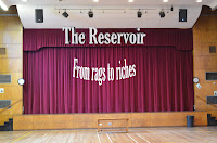
This panel is the one I intend to use as the CD holder, hence the big red circle. I used the image of the curtains as symbolic of opening the case, as I have done with the front cover. This highlights the anticipation the buyer would hopefully have of listening to the CD, as you would do when waiting for the curtains to open in the theatre.
This image was taken in the school hall, the same place as some of the footage of our film. The lights I feel stand out well in contrast to the brown background, however the big gap to the left of the picture deteres the quality of the image, and is something I will adress.
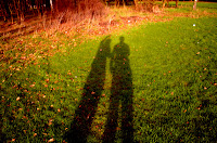
I like this image of mine and Bens shadows as it is unique and also highlights the 'natural' imagery theme I am aiming for. The way the shadows stand out I feel work well with the grass, and, as you can see, the raised arm of one of the people again highlights the notion of reaching the top, as he is pointing upwards to symbolise progression.
To gain the faded brown colour on most of the panels I had to use a brown background for each picture on 'Photoshop', and edit the picture from 'normal' to either 'Pin light', or 'Linear light', depending on which effect worked bewst in displaying the fade in each picture.


No comments:
Post a Comment