Tuesday 7 May 2013
Monday 6 May 2013
In what ways does your media product use, develop or challenge forms and conventions of real media products? (Digipak)
I apologise for the delay in sound compared to visuals but I promise you dont miss anything from what I am saying, just "in comparison with....... real life media products"
Sunday 5 May 2013
How did you use new media technology in the construction, research and planning, and evaluation stages?
My use of various technology was extremely important in the construction, research, and evaluation stages of my media products, and I have had to use a vast range of technology to make my products a success.
Apple iMacs:
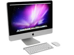 Throughout the year I have been using an Apple iMac for my coursework pieces, and have used this to enhance the creation of my products. I used the iMac for the construction stage, through the use of Final Cut Pro to help make my music video; the evaluation stage through 'Powerpoint' for my presentations, 'Photobooth' for the videos, and 'Final Cut pro' for the editing of various videos of my evaluation pieces. I have also made use of the iMacs for my research and planning towards my constructions, by researching things such as other digipaks, posters, or music videos for me to analyse.
Thanks to my use of the iMac's in my work last year, I had a good understanding of its uses and worked with it very well. There were very few problems with it thanks to me saving my work onto a memory stick as well as the iMac, meaning nothing was lost.
Sony Bloggie
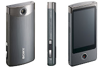 Just like last year, a Sony Bloggie was used for my coursework filming. As cameraman during my coursework piece, this piece of equipment was essential for me to understand and use effectively. Thankfully, I was also cameraman last year with the exact same camera, and so I knew how to function it properly. Unfortunately the only problem I came across was the distortion of some of the shots when zoomed in, however not many of my shots ended up requiring this camera function in the end so no blurriness was seen in my construction of the video piece.
Final Cut Pro:
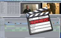 Final Cut Pro was used predominantly in the construction stage of my music video, however it was also used in the evaluation stage. Its features of adding filters and colour correctors have been extremely important to help me successfully create my final video, so that clips flow smoothly from one to another using filters such as 'Fade in Fade out', and to also help my 'Dark vs. Light' notion being displayed through the use of colour corrector, to show some of my clips in the darker, faded light.
Adobe Photoshop:
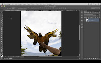 Photoshop was vital for my construction of my poster and digipak panels as it allowed me to develop the pictures I had taken and enhance the overall look of my products. The Adobe Photoshop allowed me to edit things such as lighting and size of my photos, as well as add text and crop pictures onto each other and create background images. Photoshop was new to me this year and so I initially struggled to get the hang of it, and made a lot of mistakes in the run up to my drafts and eventual final products. My favourite part of Photoshop was the 'magnetic tool' which allowed me to crop around an image and cut it out from the picture or move the cropped image from one photo to another. I used this when creating my poster in order to add the image of the artist with the background image of the piano.

Powerpoint and Prezi
 These were used through many of my blog works, and the research and evaluation parts. They allowed me to showcase my work on my blog through different forms of media than the standard blog post, and have hopefully made my blog more exciting for you to read?!
Nikon SLR 500:
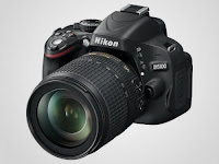 I used this piece of technology for the pictures of my poster and digipak, as the enhanced picture quality helped me to develop a greater photo type and a better quality of product.
Apple iMacs:
Throughout the year I have been using an Apple iMac for my coursework pieces, and have used this to enhance the creation of my products. I used the iMac for the construction stage, through the use of Final Cut Pro to help make my music video; the evaluation stage through 'Powerpoint' for my presentations, 'Photobooth' for the videos, and 'Final Cut pro' for the editing of various videos of my evaluation pieces. I have also made use of the iMacs for my research and planning towards my constructions, by researching things such as other digipaks, posters, or music videos for me to analyse.Thanks to my use of the iMac's in my work last year, I had a good understanding of its uses and worked with it very well. There were very few problems with it thanks to me saving my work onto a memory stick as well as the iMac, meaning nothing was lost.
Sony Bloggie
 Just like last year, a Sony Bloggie was used for my coursework filming. As cameraman during my coursework piece, this piece of equipment was essential for me to understand and use effectively. Thankfully, I was also cameraman last year with the exact same camera, and so I knew how to function it properly. Unfortunately the only problem I came across was the distortion of some of the shots when zoomed in, however not many of my shots ended up requiring this camera function in the end so no blurriness was seen in my construction of the video piece.
Final Cut Pro:
 Final Cut Pro was used predominantly in the construction stage of my music video, however it was also used in the evaluation stage. Its features of adding filters and colour correctors have been extremely important to help me successfully create my final video, so that clips flow smoothly from one to another using filters such as 'Fade in Fade out', and to also help my 'Dark vs. Light' notion being displayed through the use of colour corrector, to show some of my clips in the darker, faded light.
Adobe Photoshop:
 Photoshop was vital for my construction of my poster and digipak panels as it allowed me to develop the pictures I had taken and enhance the overall look of my products. The Adobe Photoshop allowed me to edit things such as lighting and size of my photos, as well as add text and crop pictures onto each other and create background images. Photoshop was new to me this year and so I initially struggled to get the hang of it, and made a lot of mistakes in the run up to my drafts and eventual final products. My favourite part of Photoshop was the 'magnetic tool' which allowed me to crop around an image and cut it out from the picture or move the cropped image from one photo to another. I used this when creating my poster in order to add the image of the artist with the background image of the piano.
Powerpoint and Prezi
Nikon SLR 500:
 I used this piece of technology for the pictures of my poster and digipak, as the enhanced picture quality helped me to develop a greater photo type and a better quality of product.
Saturday 4 May 2013
Wednesday 1 May 2013
Monday 29 April 2013
Final Poster; and analysis
Here is my final draft for my album poster advertisement:


When creating this I aimed to make sure that the band name and album name really stood out, and so I felt that the white colouring of the writing was highlighted in contrast with the backgriound images.
I have used the same image for my poster as I have the image on my digipak front cover, and in doing so I hope I create a link between the two. I feel that this will create a noticeable image that can be linked with the album, making the piano image recogniseable to the viewers.
Also, I have included a picture of Ben, the artist, in order to create a relationship between the band and its audience, as the more they see the bands personell, the more recogniseable and high-profile the band becomes.
I have included the release date in bold in the middle of the poster in order to increase its profile. The more that the date is noticed, the more it is stuck in the viewers' mind, much like the pictures of the piano and artist.
Sunday 28 April 2013
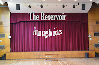
Final digipak panels
These are my final 6 panels of my Digipak, 'From rags to riches':
 |
| 1. Front Cover |
 |
| 2. Inside left |
 |
| 3. Inside centre; CD holder |
 |
| 4. Inside right |
 |
| 5. Outside centre |
 |
| 6. Back cover |
Friday 26 April 2013
Wednesday 17 April 2013
Poster draft image
Here is the background image I will be using for my poster:
 This is obviously without the extra details.
The reason I will be using this image is because it is the same image I will be using for the front cover of my digipak, and so in doing so it will help develop a relationship between the audience and the album due to the recurring image. This will mean that the audience will associate this image with our band and the album itself, making it evident what the product is we are promoting.
When making my poster for final I will include:
Band name,
Album name,
Release date,
Producttion companies,
Somgs included in the album, and,
Where it can be purchased.
Monday 15 April 2013
Poster content
After some research and analysing of other posters, below is the general content I believe should be included in my music poster;
1. Artist name
2. Band name
3. Release date
4. Album name
5. Songs in the album
6. Production companies
7. Places or how it can be purchased
Using all of this in the creation of my poster will definitely enhance my product and tick all the requirements of a music poster.
1. Artist name
2. Band name
3. Release date
4. Album name
5. Songs in the album
6. Production companies
7. Places or how it can be purchased
Using all of this in the creation of my poster will definitely enhance my product and tick all the requirements of a music poster.
Monday 25 March 2013
Tuesday 19 March 2013
New Digipak front cover
I have decided to change the look of my front cover for my digipak, mainly because I am no longer fond of the previous one. My new cover will be this;

I feel that this picture has a much better look to it, and is more fitting to the music genre of our band. The font style and colours are also more fitting to the picture, and stand out well in contrast to the colours in the background. There is still a link between our music video within this picture, as we use this exact piano in the making of our video, and this picture also fits in well with our song choice due to the piano tune heard in the song.
I do still need to add on and edit extra panels of course, which I will show on my blog when done.
Saturday 16 March 2013
Wednesday 13 March 2013
Thursday 7 March 2013
Final filming schedule; 8th March
This is our final piece of film, as we need film for the artist.
It will be in our school hall, as we need to film footage of the plaque as a symbol for the 'Hall of Fame' when our athlete wins the race. This is the same location of the footage we've had for all of that involving the artist.
The artist himself may not actually be in the footage, depending on what looks more effective, but the main focus is on the plaque within the hall; the plaque we will film has been used in our previous shots, with the artist staring up at it as somewhat of an inspiration. This final piece of footage will highlight how he has been striving to reach the 'Hall of Fame', and how his hard-work helps him achieve hgis goal.
I will be cameraman, and will take still footage of the plaque, before we edit the name 'BEN AMATRUDA' (name of the athlete) onto it under the names already up there, to signify the achievement the athlete has accomplished.
Monday 4 March 2013
2nd draft of my music video
Improvements to be made for next draft
- The clips of the artist are repetitive, so have some different shots
- to finish the race
- The middle section, it does not work effectively.
Saturday 2 March 2013
1st Draft Questionnaire results
This Questionnaire went out to 14 people (between the ages of 18-25); this is how they were answered:
1. How well do you think the sports narrative conforms to the music video?
A lot okay not a lot not at all

A lot okay not a lot not at all

3.Do you like the way the role Harry (the personal trainer) is played?
A lot okay not a lot not at all

4. Do you think that the narrative is realistic?
Yes maybe no

5. How easy to understand narrative without the missing clips?
A lot okay not a lot not at all

A lot okay not a lot not at all

6. How much does this music video inspire you?
A lot okay not a lot not at all

7.How well do you understand the concept of the plaque?
A lot okay not a lot not at all

Can you tell me what you thought worked well in this draft?
"I really enjoyed the contrast between the colours"
"The rappid cutting bit was awesome"
"I like the bit where your character switches between light and dark."
"The bit where the personal trainer chases you with a brick"
"The introduction, piano bit with the sit ups works very well."
"The serious faces at the start of the race"
"The difference in colour works very well"
"You playing the piano was Very cool"
"My favorite part was the introduction"
"The bit where you are doing sit ups and press ups"
"All of it"
"The different angles when the characters are running"
"The bit on the stage"
"The black and white works really well"
"The plaque bit is really interesting"
The phrases which are highlighted, come under two categories of the rapid cutting/introduction and the color contrast, which is exciting, as these were the ideas which we thought were original. As a result we believe that it would be significant to keep these sections of the music video, as our target audience respond to them significantly.
And then can you tell me what improvements you think could be made?
"The part with the personal trainer chasing you with the brick is unrealistic"
"The missing clip makes it hard to understand"
"Make the narrative clearer"
"Not much :)"
"Some of the running scenes do not look realistic
"Different clips of the artist"
"Get rid of the brick"
"The bit on the stage is to cheesy"
"Some of the running techniques"
"Make it more understandable"
"the artist part is repetitive"
"Maybe all should be in dark lighting"
"The brick scene"
"More of the artist"
All these highlights phrases come under three categories of the brick scene, repetitive footage of the artist and make the narrative clearer, so as a response we are going to:
A lot okay not a lot not at all

7.How well do you understand the concept of the plaque?
A lot okay not a lot not at all

Can you tell me what you thought worked well in this draft?
"I really enjoyed the contrast between the colours"
"The rappid cutting bit was awesome"
"I like the bit where your character switches between light and dark."
"The bit where the personal trainer chases you with a brick"
"The introduction, piano bit with the sit ups works very well."
"The serious faces at the start of the race"
"The difference in colour works very well"
"You playing the piano was Very cool"
"My favorite part was the introduction"
"The bit where you are doing sit ups and press ups"
"All of it"
"The different angles when the characters are running"
"The bit on the stage"
"The black and white works really well"
"The plaque bit is really interesting"
The phrases which are highlighted, come under two categories of the rapid cutting/introduction and the color contrast, which is exciting, as these were the ideas which we thought were original. As a result we believe that it would be significant to keep these sections of the music video, as our target audience respond to them significantly.
And then can you tell me what improvements you think could be made?
"The part with the personal trainer chasing you with the brick is unrealistic"
"The missing clip makes it hard to understand"
"Make the narrative clearer"
"Not much :)"
"Some of the running scenes do not look realistic
"Different clips of the artist"
"Get rid of the brick"
"The bit on the stage is to cheesy"
"Some of the running techniques"
"Make it more understandable"
"the artist part is repetitive"
"Maybe all should be in dark lighting"
"The brick scene"
"More of the artist"
All these highlights phrases come under three categories of the brick scene, repetitive footage of the artist and make the narrative clearer, so as a response we are going to:
- Get rid of the scene with harry and the brick
- Get rid of the same clips of the artist
- Then replace them with better footage of the artist
- Fill in the missing clip
- Make the narrative clearer through the two races i am going to film
Friday 1 March 2013
1st draft feedback
In order to gain feedback from our 1st draft we have devised a questionnaire for our target audience to understand what they may want to see from us.
This Questionnaire will go out to 14 people (between the ages of 18-25)
1. How well do you think the sports narrative conforms to the music video?
A lot okay not a lot not at all
2. How well do you think the colour contrast works?
A lot okay not a lot not at all
3.How well do you think the role by Harry (the personal trainer) is played?
A lot okay not a lot not at all
4. Do you think that the narrative is realistic?
Yes maybe no
5. Do you think the narrative is easy to understand without the missing clips?
A lot okay not a lot not at all
6. How much does this music video inspire you?
A lot okay not a lot not at all
7.How well do you understand the concept of the plaque?
A lot okay not a lot not at all
Can you tell me what you thought worked well in this draft?
.................................................................................................
And then can you tell me what improvements you think could be made?
........................................................................................................
Thursday 28 February 2013
1st draft analysis
This is the first draft of our music video recreation, 'Hall of Fame' by The Script.
Within the video we have tried to display the message of 'work hard and you will succeed' through the use of a sports theme. We felt that a sports theme would best convey the message we are trying to achieve due to the effort that successful athletes put in to winning races, something we have tried to display in this video. This message that we attempt to put across is very similar to that of 'The American dream' which states that anyone can go 'from rags to riches'. This view emphasises the belief that anyone can achieve greatness through hard work and dedication, which makes it appropriate for our video.
Also, within the video we have displayed a link between the visuals and the lyrics, in order to emphasise the message of the video whilst also trying to display to the audience the plot of our video as well as improving our visuals and providing a link to the song. An example of this is towards the start of the video, as they sing, "you can be the King Kong banging on your chest", and we display Ben as the artist of the song punching his chest in time with the lyrics, further promoting the link of visuals and lyrics.
 |
| (00. 26) |


>>>>>>>>>>>>>>>>>>>>>>>>
<<<<<<<<<<<<<<<<<<<<<<<<
>>>>>>>>>>>>>>>>>>>>>>>>
(1.28 - 1.31)
In addition to the 'rapid cutting' signifying the link with the music, it also highlights the change from dark to light, which is used to represent a 'change in fortune' for the athlete. We used this contrast from dark to light to display the improvement of the athlete, and that the second race would be the successful one. This sudden change of colours hints to the viewer that the outcome of the second race will be different, and that the training the athlete goes through helps him to achieve his goals in the end. This contrast in colours ties in well with Claude Levi-Strauss' 'Binary Oppositions' theory, in which two opposites signify the contrast between good and bad. Within the making of our video we took this into consideration, and we show how the 'Black vs. White' contrast further enhances the message of succeeding through hard work as the athlete loses the first race, which is shown in a darker shade, before winning the second race, shown in a lighter shade.
Furthermore, as well as the change in colour, the athletes actions and character development through the video again give the audience a hint at the outcome of the second race. We made this noticeable in the beginning of the two races, as we portrayed how the athlete had his head down in the build up to the first race, to imply a lack of confidence and belief; in contrast to, the athlete having his head up prior to the second race, to suggest new found confidence, and a will to succeed.


(0.33) and (1.45)
We also had the idea of the plaque in the video as a symbolism for a 'hall of fame', in which the athlete of the video is striving to succeed and write himself into the hall of fame. In doing so, we knew that this footage would tie in well with the motive of the lyrics, and also cleverly tie in with the songs title.
 |
| (2.24) |
To improve on the next copy of our video we plan to...
* Finish the races by gaining footage of the end results of the races
* Film and add the ending
* Fill all missing scenes
* Film more clips of the artist as some are repetitive
First draft of my music video recreation
Here is the first draft for mine and Ben's music video recreation of the 'Hall of Fame'. There are gaps in the video which we will fill with footage soon, and post again when done.
Tuesday 26 February 2013
possible digipak panels
These are the possible images I will use for my digipak. Note: These arent final so I will definitely be making changes and adding the final images to my blog!
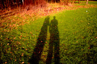


I like this image of mine and Bens shadows as it is unique and also highlights the 'natural' imagery theme I am aiming for. The way the shadows stand out I feel work well with the grass, and, as you can see, the raised arm of one of the people again highlights the notion of reaching the top, as he is pointing upwards to symbolise progression.


The theme which I am going for within my digipak is of natural imagery, highlighted by the pictures of the sky and the trees. I took all of the pictures myself and so none have been copied. The faded brown colours are that which I am going to use for each panel of the digipak so that each panel smoothes nicely onto the next and the digipak flows well.
The theme which I am going for within my digipak is of natural imagery, highlighted by the pictures of the sky and the trees. I took all of the pictures myself and so none have been copied. The faded brown colours are that which I am going to use for each panel of the digipak so that each panel smoothes nicely onto the next and the digipak flows well.

This picture really represents what the songs lyrics (Hall of Fame) are about, with the trees symbolic of reaching the top. The narrative within our video is of an athlete striving to reach the top and the tree displays how the athlete 'branches out' to reach the top, and that well known saying that 'the sky is the limit', displayed with the clouds blending with the trees.

This panel is the one I intend to use as the CD holder, hence the big red circle. I used the image of the curtains as symbolic of opening the case, as I have done with the front cover. This highlights the anticipation the buyer would hopefully have of listening to the CD, as you would do when waiting for the curtains to open in the theatre.

This image was taken in the school hall, the same place as some of the footage of our film. The lights I feel stand out well in contrast to the brown background, however the big gap to the left of the picture deteres the quality of the image, and is something I will adress.

I like this image of mine and Bens shadows as it is unique and also highlights the 'natural' imagery theme I am aiming for. The way the shadows stand out I feel work well with the grass, and, as you can see, the raised arm of one of the people again highlights the notion of reaching the top, as he is pointing upwards to symbolise progression.
To gain the faded brown colour on most of the panels I had to use a brown background for each picture on 'Photoshop', and edit the picture from 'normal' to either 'Pin light', or 'Linear light', depending on which effect worked bewst in displaying the fade in each picture.
Digipak back cover?
Here is my initial idea for my digipak back cover:


Although the back cover may look a bit blank, I am still going to add onto it the details such as Distributer and Manufacturer for the album.
I took all pictures I am using for my digipak myself, using my schools 'Nikon SLR 500' camera for its good quality photos.
To achieve the colour change from the original picture I used 'Photoshop' and added a brown background layer whilst changing the image from normal to a 'Pin Light' effect in order to merge in the brown colouring with parts of the image. I feel this effect works well, as it gives a contrast of colour to the original image and also allows the sun to be more demanding and dominant in the photo.
Aswell as altering the image, I have also added in the barcode from an internet picture, and used 'Text' to include the song names and price tag.
 |
| Edited image |
 |
| Original photo |
Changes I plan to make:
1. Include the extra details such as manufacturer and distributer
2. Perhaps include album title on back cover also
3. Include more song choices as only 4 choices is small for an album
Monday 25 February 2013
Saturday 23 February 2013
Friday 22 February 2013
Digipak front cover
Here is a picture of what my digipak front cover image will look like.
The thought process behind this image is that it is simple and not too 'overpowering' as to distract attention away from the band name or album name, which is essentially what we are trying to display.
In addition, the curtains suggest that a show is about to start, which highlights the anticipation and excitement one feels as a show is about to begin. This can be converted to display how my album would excite its audience and that in opening the curtains (a metaphor for opening of the digipak) the audience will be pleased with what they find inside.
Furthermore, the title of both the album and band are written in a bold white, which makes them stand out in contrast to the red of the curtains. This allows the audience to be drawn to the names due to the way they stand out, and so our band name will be the first thing they're drawn to.
Lastly, there is a strong link between the front cover and our music video itself as this cover is a scene in which we used in the video, and so this intertextuality can be shown to promote our video through my digipak.
Thursday 21 February 2013
Album name
I have decided to go with the album name of: 'From rags to riches'.

I feel that this name highlights the message of the song perfectly and also ties in well with the new, more serious outlet that our band is trying to represent. This album name also reflects the inspirational nature of our video and the songs lyrics, as we have attempted to portray an athlete that works hard in order to go from loser to winner, something that the 'American Dream' represents.
I feel that this name highlights the message of the song perfectly and also ties in well with the new, more serious outlet that our band is trying to represent. This album name also reflects the inspirational nature of our video and the songs lyrics, as we have attempted to portray an athlete that works hard in order to go from loser to winner, something that the 'American Dream' represents.
Possible Album names....
Unsure as what to call my album name (although I should know by now), so here are a few ideas I have;
'Gold'; this name would fit well with the meaning of the 'Hall of Fame' lyrics aswell as our video, as gold is the colour typically associated with sporting success, i.e. Gold medals.
'Dreamers'; this would link in well with the 'dream come true' notion hinted at within the 'Hall of Fame' lyrics in the sense that anything can be achieved.
'From rags to riches'; this name ties well with the intertextuality within the 'Hall of Fame' of the 'American Dream'. The 'American Dream' is the belief that anyone can go from 'rags to riches' to achieve greatness if they work for it; this supports what we are trying to display within our video.
Wednesday 20 February 2013
Filming schedule....
Although we have filmed the vast majority of the footage we require, we still need the completed footage of the two races, to show the development of Ben as the athlete from winner to loser. In order to do this me and Ben have devised a further filming schedule for the 22nd February.
We will again be needing the help of our friends for our filming, and so thanks to Harry, Sam G, and Sam H who will be helping us out.
Location: River Lea, the same place as the footage of the athletes training due to its accessibility and ideal environments for a cross country race scene.
We will again be needing the help of our friends for our filming, and so thanks to Harry, Sam G, and Sam H who will be helping us out.
Location: River Lea, the same place as the footage of the athletes training due to its accessibility and ideal environments for a cross country race scene.
Equipment list and character's clothing
For my filming I have used a 'Sony Bloggie', the very same camera that I had used for last years filming, which was convenient as I had previous experience with the camera prior to this years filming.
Bens Characters;


 |
| Sony Bloggie |
Bens Characters;
The sportsman:
In order to portray the character in training and during events, Ben's character wore typical sporty clothing during filming; football shorts and socks, a casual T-shirt, and a pair of football trainers.


The singer:
When Ben plays the character of the band member he wears a casual/smart outfit, portraying a stylish and 'cool' singer. In doing so he reflects the up-to-date song choice and our attempt to fit our video in with todays popular songs.

Subscribe to:
Posts (Atom)